Guess what, this blog is turning 5 years old by the end of the month! To mark this milestone (well it is for me, anyway), I’ve decided to turn the substance factor up a notch and post more graphic design-related entries*. And by that I don’t mean sitting idly and blogging about pretty things like I usually do so I’ve decided to make a new category called “What’s the Story Morning Glory” because believe it or not I was once an Oasis fan I want to give you a behind-the-scenes peek at the design process of certain projects I’ve handled**. A lot of the time, people perceive design as just that – eye candy. What they don’t know is that every work of art has a “story” behind it and with this project, I hope to communicate that most artists don’t just throw paint on canvas for no reason. Hopefully it also helps students who ar looking at being in the design biz someday.
*After all, that’s what I do 95%* of the time when I’m in front of the computer . The other 5% is spent surfing favorite sites, downloading music, answering email and playing Snood. **By the way, this is also the concept of the presentation I suggested to Liga that we do for last month’s MBD where I presented the story behind my design for UltraelectromagneticJam.
***
I originally intended my first WTSMG entry to feature the evolution of the design for my web portfolio but unfortunately (or fortunately, hah!) I didn’t keep screen grabs of what past incarnations looked like. You can satisfy your curiosity via The Wayback Machine but the earliest record that they have of my site is dated November 1999 and they didn’t keep earlier records of my circa 1997 Geocities and 1998 Tripod sites. Oh well..

So instead, I’ll just talk about the design for the spanking new Blow-Up Babies site.
1. Background: My good friend Quark called me up to say that they had a new shop opening in Gateway and that they needed a website for it. I was neck deep in work for WE but how can I say no to my kuya twin? 😉 And besides, what’s not to like about the project? It’s a recipe for everything I like: Unique product concept, check; Art and design-appreciative client, check; … Who also happens to be people I like, check.
2. Briefing: So k.t. Quark and Lia showed me the existing designs of their logo, membership card, passport and flyers which I honestly found very hip.
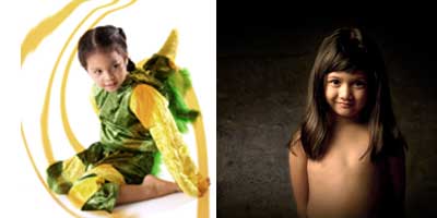
3. Development of Studies: I then developed a couple of studies that mimicked the look of their existing materials. I wanted the site to (1) showcase the kind of photos they took, and (2) communicate the rawness/freshness of the overall concept so I took inspiration from the look of Lomo photography:
4. They got back to me and said that yes, they’re nice but that the site design doesn’t have to follow the look of their existing materials. Kuya twin’s exact words – “Go wild, we want ‘Cynthia’ to shine through”. That encouraged me a lot to go all out and come up with something different yet familiar. So I developed this, which all of them liked:
Ok, I realized that it was kinda wild, was not reader-friendly at all and gasp, will take a whole lot of time to execute so I fixed it.
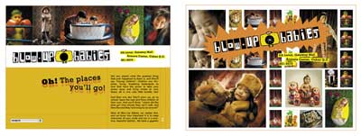
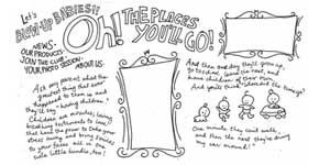
5. Finalization: And here’s the cleaner version.
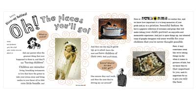
The text was written by Quark and the first line “Oh! The Places You’ll Go” reminded me of a Dr. Seuss book and since the site would feature photos of kids mostly, I thought, why not lay it out like a storybook? I wanted to retain the raw quality so I chose handwritten type and playful frames. I also learned a bit of Flash to showcase the beautiful photos without compromising space in the layout. The little retro royalty-free drawings accompanying the text adds a friendly touch and, I thought, also injected the kind of wit and humor the shops owners have.
And that eventually evolved to the one you’ll see here.
***
So please, please go visit Blow-up Babies at the Cinema Level of Gateway Mall. I told you a little about it in my previous entry, but I forgot to mention that they also take pictures of grown-ups! (Yup, blown-up grown-ups teehee). They have really creative layouts and a selection of uber-cool props so if your barkada wants a one-of-a kind group photo, or hey if you’re getting married anytime soon and don’t want the run-of-the-mill sunset-backed prenup photo, do drop by and see what you’ll end up with!