It’s been a while since I posted a What’s the Story entry so I thought I’d share with you a couple of really old design projects that I’ve unearthed from my ancient Mac’s ((My G4 is turning 8 next month! I hardly use it anymore.)) hard drive.
–
Up first, Sharon Cuneta’s “All I Ever Want” album, commissioned to me in 2001. I was ecstatic when the record company called me because I thought, ahahay! A chance to create conceptual mainstream OPM album packaging! I was free to do anything I wanted, the only mandatory was that her face should dominate the page because, well, she is the main selling point of the album. Fair enough.
–
I came up with these roughs:

The first two are the booklet’s back and front covers and the rest are sample inside flaps.
–
I wanted the design to have a painted, dreamy quality using macros of almost indistinguishable nature elements because the “want” in the album title connoted “dreams, desires, & wishes” to me. (Uhm, that made sense, right?)
–
After I submitted them, there was no word for a few days. I finally called to ask what the status was and then was told that they ((I’m actually not sure as to who “they” referred to.)) wanted something that looked like her old stuff ((Why oh why?)) and so have decided to just ask their in-house designer to do it…
–
And this ((It doesn’t look bad but I’m sorry, looking at it again 6 years later, I still think my design should’ve been given another chance. At least mine had a concept.)) is what it looked like when it came out.
–
Oh well. But there’s a happy ending to this tale: I was paid a discontinuation fee. ((And so should you if you begin a project that doesn’t get fulfilled. Remember to have that clause in your contract.)) 🙂
***
Here’s another design story, one that pushed through. San Miguel Philharmonic/Master Chorale’s “Great Original Pilipino Music album”.
–
Mr. Ryan Cayabyab is always a joy to work with, mainly because he has excellent taste not just in music but in the visual arts as well. He especially likes it when there’s a concept behind the design you present him.
–
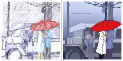
When I was sent the track list for the GOPM album, “Tuwing Umuulan at Kapiling Ka” stood out at once so I started sketching a couple of lovebirds under a red umbrella almost immediately. I wanted to show the surroundings in blue so that the couple (who were in color because they’re in love) would be the main focus. ((Cliche, I know but hey, it works visually.)) As for the jeepney, well there had to be something to make it Filipino, the title is “Great Original Pilipino Music” after all.
–
Here are my rough, initial studies. First in pencil, then a study in color.
–
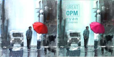
Mr. C liked it right away! I told him I would clean it up and improve on it, i.e. ask my talented artist hubby to render it like a painting.
–
Arn actually took it a step further. He thought the jeepney was cluttering the background so he arranged the elements in such a way that the artwork looked like it was telling a story. ((That’s my hubby, a natural storyteller!)) I liked it much better already!
–
But then Mr. C said that he liked the fact that the couple was already together under the umbrella in the first study although he likes the impressionist quality of the new layouts. He also told us that we could lose the jeepney if we wanted. Hmm, maybe he was right.
–
We came up with this. The lamps are supposed to make it look like the scene is in Luneta, but if you didn’t get that it’s perfectly okay. 😉 Overall, I thought it looked more romantic and was quite sure we had nailed it.
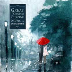
And we did! It got approved. And produced shortly after. 🙂
***
Before I end this, I would like to share something with you.
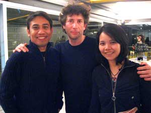
We met him! And had dinner with him ((Well technically with him tablehopping in the room. But we got to talk to him and we actually really had dinner with his son Mike who was seated at our table.))!
–
The last time he was here, we queued in Gateway but didn’t get a chance to have our books signed, although Arn had a lucky encounter (and photo op) with Mr. Gaiman in the washroom. A few days later, Azrael posted that photo in his blog. Mr. Gaiman saw it and wrote Az: Thanks to you… I learned that the nice man next to me at the sinks in the mall was Arnold Arre, whose art I had been admiring a few hours earlier. (And I wished he’d introduced himself.) Mind-blowing, right? Two years later Arn, who was a judge for the Graphic/Fiction Awards’ comics category, finally had the chance to introduce himself properly, and Mr. Gaiman was gracious enough to actually remember Arn’s name and the incident, and reiterate that he really does like his art. What a fine, fine gent.
–
More kwento and tons of photos in my Multiply.