art and design

Playing shopkeeper at BGC Art Mart 2015

I have renewed respect for everyone who stands all day at a job — they are the bees knees. 😎 As I’ve said before, I joined this year’s Art Mart in Bonifacio Global City on a whim at my friend’s encouragement. Drawing is my first love, graphic design was a career choice. I figured that if I want to reboot my career as an illustrator, I need to get my work out there in the open. I didn’t know what to expect but I thought it would be a good chance to find out which of my products sell the best before I place them for sale online, right?

So I applied, slightly nervously because Arts at BGC had sooo many guidelines and requirements. Fortunately I passed but then I only had 14 days to prepare before the actual day so those two weeks were spent in panic mode.

My art prints have been ready for a while but I had to make many more pieces of shrink plastic accessories to justify my being in a craft fair. I limited it to just 10-20 pieces per design so that I could handcraft each one with care and inspect them for durability.

I also had to think about how to properly display my work. I found an old cassette tape crate — obviously not being used anymore 😆 — in my room at my parents’ which I re-purposed and used as my card display rack. I used cheap cork boards & little chalkboards from Saizen and propped them up on mini easels to display my shrinky dink necklaces, bracelets, and pins. The little wooden frames, bowls and basket were stuff we had on hand here at home. The green necklace stand is an old gift from my friend Chinggay, and the red “tablecloth” is unused fabric that I bought way back in 2004 in Nippori in Tokyo. (I was planning to have my friend Tippi turn it into a top when I bought it but it slipped my mind! Now it has a new purpose.)

Catch my ate twin Cynthia Bauzon Arre @arncyn’s #crafts today at Boni High street!!!

A photo posted by Quark Henares (@quarkhenares) on

What I didn’t expect:
1) The heat! Our tables were right in the middle of the activity center which has. no. roof. And oh my gosh there were no tents! 😯 The very nice organizer apologized profusely and said that she really fought for the tents but sadly, we were out under the scorching heat for five hours. Thankfully Arn and I had a small umbrella in the car but it didn’t help much — I’m as red as a lobster right now.
2) The wind. Don’t get me wrong, I’m thankful that there was a breeze at all but my display was in constant danger of falling apart.
3) The almost never-ending throng of buyers from 4-9pm and even beyond. Happy problem. Not complaining. 🙂

business booming at @arncyn’s booth here at #bgcartmart! they’re here ’til 9!

A photo posted by ramon (@ramondeveyra) on

Lessons learned for next time:
1) Bring lots of water in a cooler. There was very little chance to leave my table — besides, it was one of the rules that “the artist should always be present.” If not for a kind soul, Alexander de San Miguel, a comics scene friend, we would have dehydrated. Alexander pleasantly surprised us by bringing us drinks from time to time without us even asking him. 🙂
2) Bring sunblock!!! And an umbrella.
3) Wear breezy, comfortable clothing. My t-shirt was light-colored and thin enough so my upper body was okay but my skirt was made of somewhat heavy fabric. Next time remind me to wear linen.
4) Have more prints available. I ran out of some but at least now I know which of the drawings are the favorites.
5) Bring lots of small bills. Self-explanatory. 🙂
6) Take a few little breaks to go around and visit the other stores. I regret not being able to check out the amazing stuff in the market because I was glued to my booth. 🙁

A photo posted by Cynthia Bauzon-Arre (@arncyn) on

Also very grateful for the support of Arnold who gamely stood there in the sun to help me out. <3 We were both exhausted at the end of the day but we were happy to have met so many people. I also loooove that we got to make friends with some customers and fellow artists/crafters. <3 If you were among those whom I talked to on Saturday, thank you so much for dropping by my booth. My smile that day was thisbig because of you. 🙂

shiba inu bgc art mart
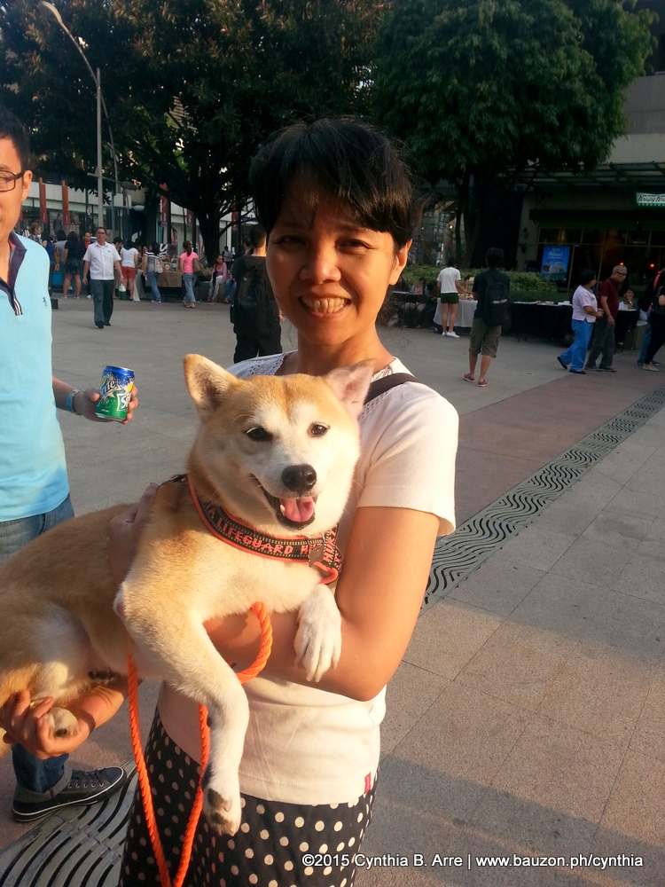
By the way, remember the pet portraits I made of my friend April’s shiba inus before? Here is one of the dogs, Mya. 🙂

I would love to talk more about the experience but I’m sleepy now so I’ll just leave you with my photo album, here.

Will I do this again? Definitely! But maybe just twice a year at most. Right now what I need to focus on is making more illustrations and finally getting my locally-based shop up and running. It’s up! 🙂

Share
Read More

Watercolor Tests: Gansai Tambi, Van Gogh and Prang

Last time, I promised I would share test watercolor illustrations I’ve done using my Kuretake Gansai Tambi paint set. Well it turns out I’ll be showing more than that because Arnold surprised me with a 24 half-pan set of Van Gogh watercolors which of course I couldn’t wait to try out too. <3 🙂

For consistency (and because I didn’t want to waste expensive paper 😥 ) I used an P88.00 Daiso / Saizen children’s waterolor pad for the studies. They turned out nicer than I expected but the paints will surely look much better on Canson, Arches and other artist-grade watercolor paper.

1) Sample watercolor portrait rendered using the Gansai Tambi – 36 half-pan set

kuretake-gansai-tambi-watercolors-test

This set is supposedly artist-grade. It comes with metallic colors, are semi-moist, and can be used for both transparent and opaque (like gouache) executions.

Some notes: I’m so used to Prang’s transparency that using this for the first time was a bit of a challenge because the colors are dense and rich so half the amount of layering I’m used to was necessary. It also took me a while to figure out a good flesh tone mix because there were so many options for red, yellow, and orange. I guess these are all happy problems, ‘no? The variety of colors provides endless possibilities and I can imagine that these paints will last a long time since a little goes a long way. I also noticed that the colors remained vibrant even after the paint dried.

The set is really big by the way which means it probably won’t be leaving the house with me. Or I could take individual pans I need and put them in a little tin to make a portable version… but that’s too much trouble, and that’s what the next paint set is for.

2) Sample watercolor portrait rendered using a Van Gogh 24 half-pan set

van-gogh-watercolors-test

Some sites like DickBlick have listed these paints as artist grade since they are said to be lightfast and archival but others have bunched it up with Cotman as high-quality student grade. (Apparently Royal Talens uses the same pigments for these as they do in their artists range.) Since I usually digitize my artworks I’m not sure if that matters. However, I was surprised with the brilliance of these paints, again compared to Prang and even the Gansai Tambi. The cakes aren’t as dense as Gansai but the colors are just as intense and a little swipe with the brush goes a long way,  Transparent washes are easy to achieve and the colors remain vibrant even after the paint has dried. I also love how watery color puddles form little pigment outlines once dry.  Oh! And if you draw people a lot, this palette already comes with “Naples Yellow Red” which is a perfect flesh tone base. Love, love, love Van Gogh. <3

3)  Sample watercolor portrait rendered using a 16-color Prang watercolor set

Ahh but I still do love Prang. It’s very affordable, it produces beautifully transparent washes, and is fantastic for layering. I’ve been using the brand since high school and this one below is already my third set. They last a long time with me since I tend to use a lot of water. 😉 Just to compare, here are recent watercolor portraits I’ve made with Prang.

prang-watercolors-test

These illustrations were drawn on high quality 180 gsm Arches paper just last week but here’s where we can see the difference between student and artist grade paints. Obviously Prang’s colors don’t retain their brightness as well as Gansai Tambi and Van Gogh. If I’m going to scan the artworks anyway, Prang should be okay, but for portraits that will be displayed in brightly-lit conditions, it seems I’ll have to go with the more fade-resistant paints.

***

…Wait, there’s more! Actually, Arnold also gave me this Bienfang Watercolor Brush Pens set (he really wants me to keep painting, doesn’t he? 😆 ) which I’m having a hard time getting used to because of the intensity of the inks. I think it’s best for more comicky-looking illustrations, like below.

bienfang-waterbrush-markers-test

Not sure if you can tell but I had a difficult time rendering her blouse and neck. 😳 I’ll post more work using these pens soon.

Hope you enjoyed this watercolor comparison and review of sorts. What are your favorite watercolor brands? Do leave a comment to share your faves!

Share
Read More

Watercolor “Kilig” Couple Portraits

When I started drawing actively again late last year, I think my unconscious aim was to rediscover the mojo that, as evidenced by this blog post, somewhat fizzled out due to dependence on Photoshop and Illustrator. Now that I got my fill drawing animals, plants and flowers teehee, I’m finding myself being drawn to figure drawing and watercolor. At first I thought colored pencils were going to be my go-to medium (I still love them but they make my hand hurt after a while) but after doing the portraits of the Eraserkids, I felt the urge to keep on painting.

I knew I wanted to paint more people and again I remembered this old artwork that I made in school.

cynthia bauzon arre
“Fence” 1990

I figured that it would be fun to paint couples in “kilig” moments and realized that hey, the anime, J-dramas and J-movies I’ve been watching all these years are full of those. Not only will I get to hone my figure drawing and watercolor painting skills, I’ll also get to draw my favorite characters.  😉

So, if you’ve been keeping an eye on my Instagram feed, you’ve already seen these. But since you’re here, let me tell you the back stories for each of them. I didn’t want to just copy and make illustrated versions of stills and posters so I added a few twists.

bokura ga ita fan art

1. The artwork I made for “Bokura Ga Ita” (on the right) was based on a scene in the anime series’ closing theme (top left) but I tried drawing the characters as they were portrayed in the live action movies which starred Ikuta Toma and Yoshitaka Yuriko.

koizora fan art cynthia bauzon arre

2.  I based my fan art for “Koizora” on the manga poster (top left) but again, I used the live action movie’s actors’ (Gakki and Haruma Miura) likenesses in my drawing. Of course I also took some liberty with their outfits. It’s so warm that I couldn’t bring myself to draw cold weather clothes. 😉

nodame cantabile fan art

3. For my “Nodame Cantabile” fan artwork, I tried to do the opposite — base the pose on the live action poster and draw them as the anime characters. But I love Ueno Juri and Tamaki Hiroshi so much that I ended up drawing them as they were…. except, again, for the winter clothing. 😉

Beck anime fan art

4. My most recent fan art is for the anime series “Beck.” Arnold and I love this series, thanks to the recommendation of my brother Calvin and wife Inches. 🙂 The pose in my fan art isn’t based on anything but the outfits are inspired by what Koyuki and Maho wore in the anime and the faces are again based somewhat on the actors.

(Slight diversion: To be honest, we thought Sato Takeru and Kutsuna Shiori were miscast as Koyuki and Maho respectively. Takeru was perfect as Rurouni Kenshin but as Koyuki? Koike Teppei would’ve been more believable… but that’s just my opinion. As for Maho, I think Chiaki Kuriyama would’ve been a more suitable choice. And my biggest issue with the film — why no singing voice for Koyuki?)

***

On another note, I’m excited to use this thing of beauty in my upcoming artworks.

I’ve been using school-grade watercolors since, well, school (not that there’s anything wrong with Prang which has served me well) so I thought it was high time to go a bit more pro. I ordered this Kuretake Gansai Tambi set of traditional Japanese watercolors as an – ahem- advanced birthday gift to myself. It came in a big and elegant green box with the Kanji characters for “Gan-Sai-Tan-Bi” and inside are 36 big pans of creamy, candy-colored goodness. [insert heart-eyed emoji] The 36-color set includes three glittery paints — gold (kin), blue-gold (aokin), and silver (gin) by the way.

I couldn’t wait to try it out so I quickly doodled cupcakes, both in a washy transparent and opaque gouache-like style. It looks thick and creamy at first glance but, depending on how much water your brush is loaded with, it will glide smoothly and as transparent as you want on paper. It appears that I can use these on dark colored surfaces too though I haven’t tried that yet. I’ll show you more work using these soon!

Share
Read More

I'm Cynthia Bauzon-Arre, a Filipino watercolor artist & graphic designer. I live in QC with my graphic novelist husband Arnold and our friendly marmalade tabby Abbas. This blog has been chronicling my life, likes, and loves since 2001. [ more ]

view my portfolio

Categories

Archives