design projects

CandyMag feature, live watercolor portraiture at Hey Kessy, new items in stock!

Just a quick update! This week’s highlight is definitely the feature on my painting beginnings and works-in-progress on Candy Mag (*heart eyes emoji*).

candymag feature

I was just telling friends that it would’ve been nice to have a publication like Candy when I was a teen. Locally we only had Panorama and MOD(ikr?) so I resorted to saving up and buying copies of Tiger Beat and Bop! at the bookstore near my high school UPIS along Katipunan (now transformed into what’s known as the UP Town Center).  I don’t remember what that book shop / magazine stand was colled but I remember it being at the back of Vinzon’s Hall in UP so I had to cross the bustling Katipunan avenue just to get there — kind of risky for a 13 year old, now that I think about it.

So anyway I was happy to have been chosen by Candy to feature in their section called “Creative Space”, many thanks to Macy Alcaraz and the team! <3

***

Speaking of UP Town, I had another live portrait session at Hey Kessy’s “Better and Brighter” party/launch at the spanking new location on the 2/F of the Urban Turf wing a few weekends ago. 🙂  Here are photos of the lovely ladies I drew. (Were you one of them? :))

cynthia bauzon arre watercolor portraits

There are more behind-the-scene photos in my Facebook Page (here’s the direct link to the album) and on Hey Kessy’s blog. Here’s a video too, in case you’d like to see me in actio.

***

A photo posted by Cynthia Bauzon-Arre (@arncyn) on


And finally, I’ve updated my online store! Please do check out the new stuff when you have time. <3

Share
Read More

What Colors to Choose for a Minimalist Watercolor Palette + White Nights Review

Since White Nights (a.k.a. St. Petersburg) Watercolors from Russia became available here in Manila via Deovir, I’ve read a lot of reviews online and have even heard from art-friends that they are easy to re-wet and are highly pigmented. So, being low on EQ I decided to get a few pans for myself. You might already know that I’m not a fan of buying sets (though I have some but they’re either gifts and/or were purchased when I hadn’t the slightest clue about pigments and lightfastness) so I made sure to do my research before buying the paints. My self-imposed rules:

  1. I must be able to use the colors and their combinations in what I love to draw the most — faces, food, and felines (okay, animals in general :))
  2. The colors must consist of single pigments — this is to ensure lightfastness and also reduce the incidence of mud when layering.
  3. They have to fit into my handy DIY mint tin palette, meaning a maximum of 9 pans was in order.
  4. I can’t spend over P1,000.00 because do I really need another set of paints? Umm, no  (see previous post), but then need is sometimes < want. Fortunately White Nights, like ShinHan, isn’t as expensive as the other brands so I was able to stay below my limit.

White Nights Watercolors customized palette

So taking all that into account, here are the colors I ended up with along with their pigment info & light fastness ratings:
— 2 reds (1 cool, 1 warm): Madder Lake Red Light (PR 187 / LF ***) and Cadmium Red Light (PR 108 / LF ***)
— 1 warm yellow: Cadmium Yellow Medium (PY 35 / LF ***)
— 1 green: Emerald Green (PG7 / LF ***)
— 2 earth hues: Raw Sienna (PBr 7 / LF ***) and Burnt Sienna (PBr 7 / LF ***)
— 2 blues (1 warm, 1 cool): Ultramarine (PB29 / LF ***) and Prussian Blue (PB27 / LF ***)
— 1 neutral: Payne’s Grey (PBk7, PB15, PV3 / LF **)
[source]

The last one, Payne’s Grey is not a single-pigment color (it’s made up of 3 pigments) and is something I could’ve gone without since I can mix greys using some of the colors so it’s really just a handy “convenience hue” for days when I can’t be bothered to do extra mixing. 😀

Just to show you the range of colors that are possible using just these 9 pans, here are a couple of watercolor charts I made:

White Nights Watercolor Chart

This one (above) shows the range of color combinations and tonal ranges that can be achieved from mixing the brights with the darks. And just because I always paint portraits and people, I made a separate color chart mainly for the reds and yellows (below). I just added the column for green since there was extra space.

white nights watercolor chart skintones

Here’s something I painted using just the colors in the palette (you can view the work-in-progress video on my Instagram). I used them on Khadi Paper purchased a while back from ArtWhale.

white nights watercolor palette

My capsule review for White Nights Watercolors:
1. Indeed they are easy to re-wet, pick up with the brush and are highly pigmented (some colors more than others though)
2. They are also highly transparent — except for the Cadmiums which are opaque — so they are great for layering.
3. At only P87.00 per pan (except for the Cadmiums which are I think P120 / pan), they are quite affordable. My customized set amounted to around P849.00 and it consists of colors that I will actually use. (Sets usually have 3 or more pans that I always end up never using.) Also, these are FULL pans, not half pans, so you get a lot of paint for your hard-earned cash. 😛

And here is something else I painted using White Nights, a simple maguro sushi for my Youtube Channel (hah! If you’re one of my whopping 3 regular viewers, thank you for not laughing at my attempts to make these home videos <3)

Other observations:
1. ShinHan, Holbein, and Daniel Smith are still my favorites in terms of color intensity and flow but I’m happy to have this inexpensive set of vivid paints for drawings that will be scanned and for practice work. Van Gogh, my student-grade set that was a birthday gift from Arnold last year, is my other go-to for practice work but they are strangely more expensive than White Nights.
2. The pans remain moist for a while so I can’t close the lid of the tin until they dry completely because they might stick in the lid when I store them sideways.

Share
Read More

My favorite watercolor papers

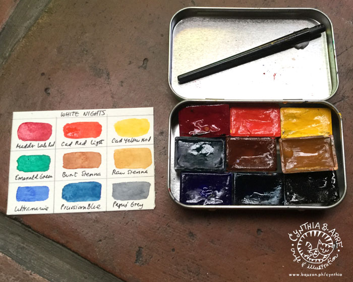
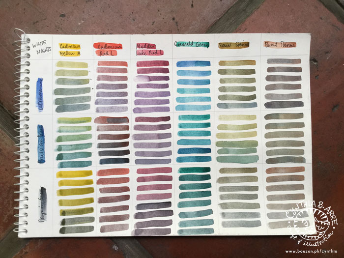
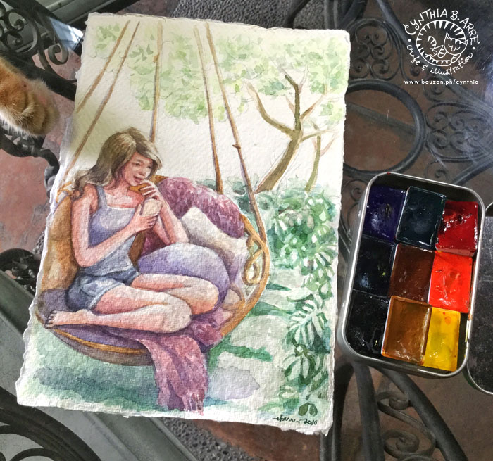
I recently blogged about my watercolor paints and brushes in two parts — ONE / TWO

However, what good are those wonderful paints and brushes for without beautiful, high-quality paper? For daily practice work, inexpensive student quality pads like the Canson papers with the hot air balloon drawing on the cover that you can find at NBS and a Monologue Sketchbook (which I’ve also been abusing using) are great to have around but for commission work, it’s more appropriate to use paper that will allow illustrations to shine and last for a long time.

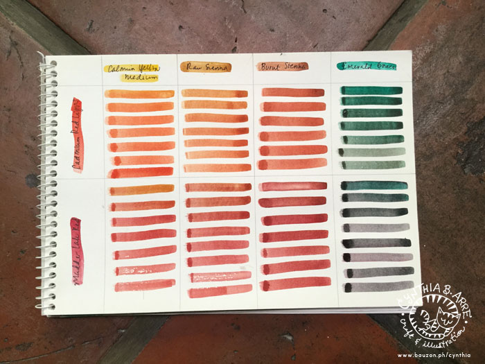
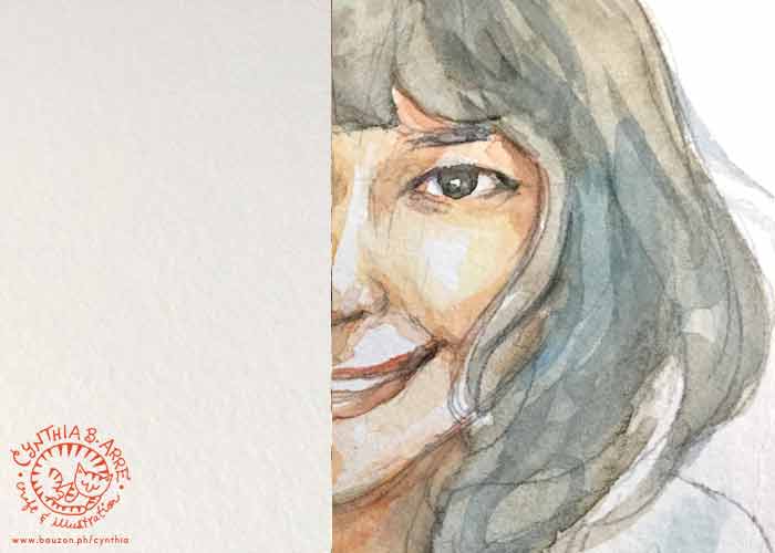
Here are some of my staples (so far) along with close-ups of samples of my illustrations using the different papers so that you can see their textures up close as well as how colors respond to them

.comparing watercolor papers

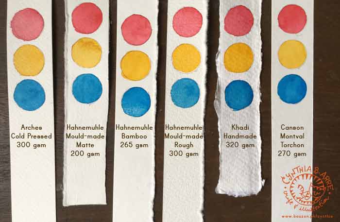
L-R and in no order of preference, these are the paper brands I keep going back to: Arches, Hahnemuhle, Khadi, and Canson. I’ve been hearing good things about Fabriano and Strathmore too but I have to wait for my shipment to arrive so I can try them out. The red, yellow, and blue paint I used for the comparison shot above are Shinhan PWC Permanent Red, Cadmium Yellow Deep, and Peacock Blue (from ArtWhale).

All of the above are acid-free and, save for Canson Montval Torchon which uses 100% cellulose, are fine artist quality papers made of natural fibers like cotton rag and bamboo in Hahnemuhle Bamboo Mixed Media Board’s case. Below are some notes:

arches watercolor paper sample work

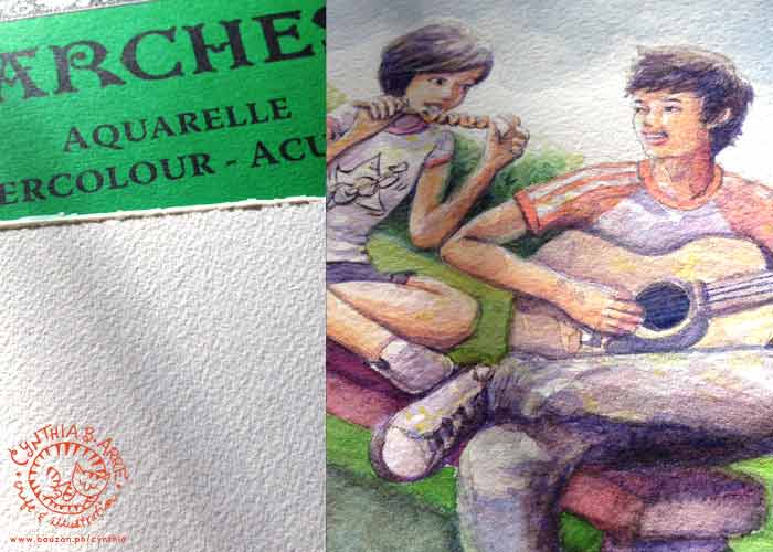
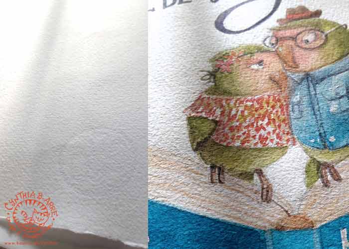
Arches Cold-Pressed Cotton Watercolor Paper, 300 gsm (available at NBS and some Fully Booked branches though I got mine from Amazon.com)

I prefer cold-pressed to hot-pressed watercolor papers because I love the rough texture which IMHO lends an organic feel. Arches 100% cotton paper has a nicely coarse “tooth” that seems to absorb pigments easily which allows colors to remain vibrant and intense. I’m also able to paint big juicy washes and draw fine details with minimal buckling, even when I don’t stretch the paper (which I really usually don’t, being lazy). At 300 gsm, it’s also thick enough to handle re-wetting with no visible damage when I make mistakes. 😛

***

Hahnemuhle matte watercolor paper

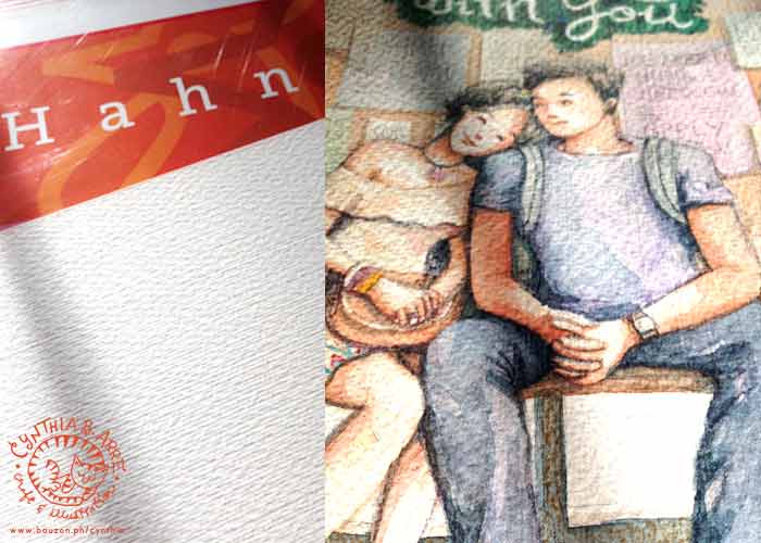
Hahnemuhle Mould-Made Watercolor Paper (Matte), 200 gsm (available at Deovir Arts)

Arnold introduced me to this paper so it was the first “fine art” paper I ever used. (I’m a bit embarrassed to admit that all of my watercolor work from years ago were done on yellow-backed illustration boards and sketch pads). Because of that, this has become my “benchmark” paper. It’s awesome for wet-on-wet painting (the paper drinks up the water & pigments without diminishing color vibrancy) and as you can see above, I can also do crisp-edged drawings on it with no problems. At 200 gsm, I avoid painting large washes though it may be possible if stretched beforehand. Mistakes are also easy to re-wet and “erase,” making it an ideal choice for beginners. It’s very economical to buy big sheets of these and tear them down to a more manageable size. The deckle edge is a nice touch and it’s inspired me to keep the torn edges when I tear it up into smaller pieces for a raw handmade look. 🙂

***

Hahnemuhle mould made watercolor paper rough

Hahnemuhle Mould-Made Watercolor Paper (Rough), 300 gsm (available at Deovir Arts)

This one comes in block form and has a rougher, slightly raised and woven texture compared to the matt variant. A block is very convenient since you can immediately apply large washes with no need for stretching. I found the weave-like texture off-putting at first since I was already used to the fine-grained fibrous texture of Hahnemuhle’s matt paper but after using this for a while. I learned to like it as well. It appears that the pigments sink and “sit” in the grooves and so deep, rich colors are preserved.

khadi handmade watercolor paper circle

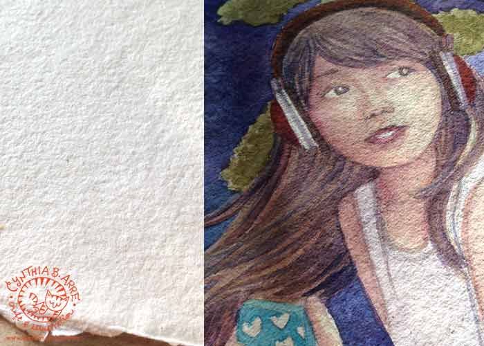
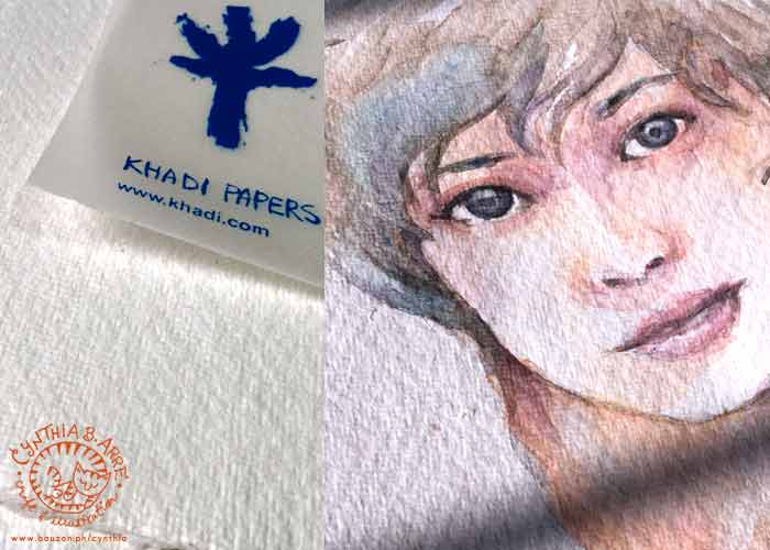
Khadi Handmade Paper 320 gsm, circle (above) and A5 (below) — (available at ArtWhale)

At 329 gsm, this paper handmade in India is thicker than all the other natural-fiber papers I’ve tried and because it’s made of long-fiber cotton rag (upcycled t-shirt cuttings, anyone?), it seems to be more absorbent than the other papers. The painting above was done on the circle variant (which reminds me of pita bread 😉 ) months ago using ShinHan Korean Colors but because the pigments were fully absorbed by the paper, it looks as if it was painted just yesterday. Also, as you can see almost the entire surface is covered in watercolor but at 320 gsm, the paper didn’t buckle much and actually stiffened a bit once the paint dried — possibly because the rag combined with the pigments.

The A5 variant (below) has a slightly finer grain. Since my first artwork is almost opaque, I tried to see how the paper react to a transparent wet-on-wet technique and it performed beyond my expectations. 🙂 The paper was able to soak in a lot of water and it never once buckled. Also, just look at how rich the colors stayed even after the paint dried (I used ShinHan PWC paints for the test below). The A5 size is perfect for portraits too and the deckle edges add a beautiful handmade touch.

khadi handmade watercolor paper a5

***

hahnemuhle bamboo mixed media board

Hahnemuhle Bamboo Mixed Media Board 265 gsm (available at Deovir Arts)

This is an all-in-one artist-grade paper made from 90% bamboo fibers and 10% rag which can be used with watercolour, gouache, acrylics, colored pencils, chalk and oil pastel, stamp pad inks, etc. It comes in sheets at Deovir (for around P118 per 19″ x 25″ sheet) which is great value since you can cut it up into smaller pieces and it can handle almost any media. The surface is smooth and watercolor glides on it with ease. I like using this paper with the wet-on-dry watercolor technique since colors seems to maintain brilliancy that way.

***

Canson Montval Torchon watercolor paper

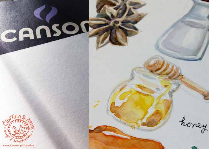
Canson Montval Torchon Watercolor Paper, 270 gsm (available at NBS and Fully Booked)

Among relatively inexpensive student-grade papers, this is the closest I’ve found that can mimic the behavior of premium watercolor paper. Made from archival cellulose, the texture is similar to that of Hahnemuhle Bamboo’s — smooth but grainy enough to absorb paint and give paintings a “watercolory” look, meaning it won’t look like the paint is just sitting on top of the paper. At 270 gsm it’s not prone to much buckling unless you’re doing heavy-duty washes. Remember though that this isn’t fine art paper and drawings might eventually fade so make sure to use this only when you will scan and digitize your work.

I would love to know what brands and kinds of paper you like using. Please do share in the comments section. 🙂

See also:

Share
Read More

I'm Cynthia Bauzon-Arre, a Filipino watercolor artist & graphic designer. I live in QC with my graphic novelist husband Arnold and our friendly marmalade tabby Abbas. This blog has been chronicling my life, likes, and loves since 2001. [ more ]

view my portfolio

Categories

Archives