[ad#468x60cjbanner]
One of the questions I often get asked is “who are the graphic designers you admire?” It’s quite a list actually so I hope you have time because I’m gonna take you through it right now.
***
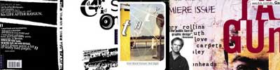
David Carson. He was the Nirvana and Pearl Jam of the visual movement in the 90s. His work on Raygun changed the way I looked at graphic design forever — now here was someone who came up with attention-grabbing work by tossing the rulebook out the window. If you’ve seen the Pillbox magazines and a lot of the local Pepsi ads in the 90s, you’ll see how heavy his influence was on the art director. ((Oh wait a minute, that’s me hehe.))
***

Neville Brody. Consistent use of loud colors, big and bold type, and striking graphic elements make his work distinct and memorable. It was also through studying his work that I learned the proper use of typography ((My ultimate pet peeve: “designers” who stretch, squash and distort type. Ugh, I see it here all the time.)) as a design element. His designs seem to have a life of their own, they leap out of the pages containing them, just like the designer himself — he didn’t stop at print and has branched out to motion and space design as well. ((By the way I have a copy of the Propaganda album, 1234, which is one of his earlier designs. I swear I’ll have it autographed someday.))
***
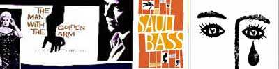
Saul Bass. This man is a legend, just take a look at the work he’s done — they include iconic posters and logos that have stood the test of time. The use of flat colors, blocky hand-lettered type, and simple shapes define his minimalist style. It’s most likely a testament to the limitations in printing during his time but I’ve always believed that when it comes to visual communication, the simpler and the more straight to the point, the better. Right? 😀
***
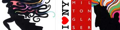
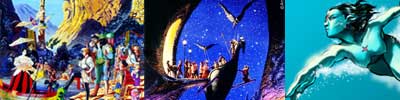
Milton Glaser. You’ve seen his “I *heart* NY” logo a million times, but the body of work he’s produced speaks volumes about his range as a designer. I can’t say he has a particular style because when you look at his designs, they don’t look like they came from just one person. But the randomness is good in that it shows versatility. Of his work, I like the ones that have illustrations the most. His psychedelic, free-flowing drawings seem to take us back to a time when producing art actually meant freedom of expression (and didn’t involve deadlines).
***
Locally, I have my design heroes as well and fortunately I’ve had a chance to work with them.
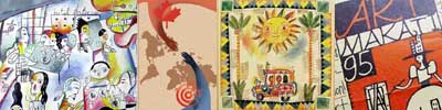
Robert Alejandro. Sir Robert is best known for his whimsical and stylish artworks for Papemelroti and the Ayala Malls. He was my Figure Drawing and Advertising 101 teacher in 3rd year college ((In 1990. That was the ONLY year he ever taught, lucky us.)) at the UPCFA and he just blew everyone away with his art and out-of-the-box way of thinking. Ask anyone in my class and they’ll tell you that he was the one who inspired them to be (a) an advertising art director; (b) a children’s book illustrator; or (c) a graphic designer — all of which he was. ((I guess I’m guilty on all three counts.)) How cosmic is it that we formed and now belong to the same design group?
***
Raymond Legaspi. He’s not as publicly known as Robert but he’s a force to be reckoned with in the Direct Marketing world, having won a ton of awards locally and internationally. Mr. Ray was my very first boss — I had my OJT at J. Walter Thompson in 1991 and was assigned to be his trainee. A few years later, we worked in the same company, Ogilvy & Mather, as colleagues where he was certainly one of the few art-based Creative Directors I had huge respect for because he always stressed on the importance of a big idea in visual thinking, unlike some who focused primarily on execution. ((I think the ultimate compliment was when he recommended that I be part of the Design Jury for last year’s Ad congress Araw Awards. I knew then that I’ve somehow earned his nod.)) Incidentally, he retired from the corporate world just a few weeks ago to pursue his first love, painting.
***
And of course,
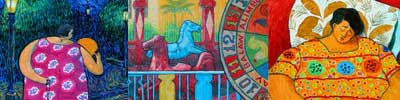
Arnold Arre. I know, I know, he’s my husband but to be honest, I’ve admired him and his work waaay before we even met. The first time I ever saw his paintings for Mythos, my mind just reeled at the detail he put into all of them — intricate brush and pen work, the stories behind them ((Yes can you believe it? Ask him about a character in his painting and he’ll tell you the back story he thought up for it.)) — the overall distinct style and theme of the entire exhibit was just so well thought of that I knew this guy was an intense and very passionate artist. The same goes for every piece of work he churns out, everything has a story. Everything has a reason. And isn’t that what good design should have? Reason. To matter.
(read part two)