Since I’ve been painting again almost everyday for months now, I thought I’d share my current favorite watercolors and tools with you as well as a few notes and photos about how I’ve been using them. (See also: My watercolors, brushes, and painting tools (Part 2) and My favorite watercolor papers )
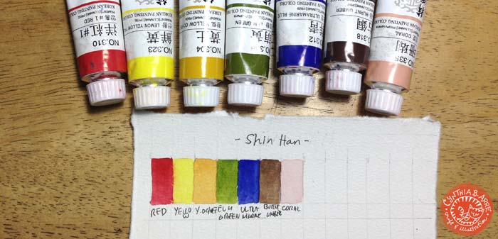
1) ShinHan Korean Colors, which I wrote my first impressions about previously. These paints seem to work best for the “moody” illustrations that I like to make. I love how vivid the colors are and I think this is mainly due to the binder being refined gelatin and not gum arabic which is the traditional binder for Western watercolors. After a bit of research and also through experience, I learned that having gelatin for a pigment binder results in a finish that’s more opaque than watercolors but more translucent than gouache or poster colors. I’ve also tried adding a few drops of gum arabic to make them more transparent but 99% of the time I just use them as they are.
Best for: paintings with scenery and a lot of detail and background elements. Using more water allows me to achieve a watercolory effect, and layering on the colors produces a painterly look.
*Available locally at ArtWhale in sets and individual tubes
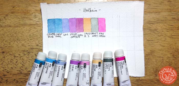
2) Holbein Watercolors. I’ve always been curious about this Japanese-made brand so I purchased a few tubes last month, taking care to pick cooler colors as my ShinHan tubes were all warm tones. I’ve read that since the paints don’t have ox gall, they are richly pigmented and slow-moving. Like ShinHan, they’re also thicker than traditional Western watercolors but they can be thinned down with water for a transparent, muted finish. They are beautiful, creamy colors although I haven’t used them much in my paintings — maybe due to my color choices since so far I’ve only used them for flowers, save for Jaune Brilliant no.2 which I’ve been using as a base for skin tones. I’m planning to buy warmer hues sometime in the future since those are what I use more often anyway.
Best for: floral art, thick color applications, and probably lettering and calligraphy where you’d like to preserve brush strokes because the paints are formulated for classical Japanese-style painting or Nihonga.
* Available locally at ArtWhale and Deovir Arts in sets and individual tubes
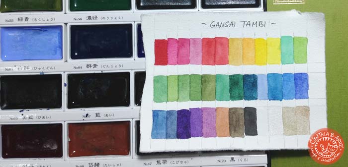
3) Kuretake Gansai Tambi 36-color set, which I also wrote my first impressions about months ago. Having used it a lot more times now, I find that I always reach for this set when adding foliage and background elements to a painting because of the bright, beautiful colors and the vast color range — there’s almost no need to pre-mix specialty colors. I don’t use it as often for portraiture though because it takes me too much time to mix a skin tone I’m happy with (2017 UPDATE — I used the set for the portrait demo below).
I also like the addition of pearlescent colors which are handy for adding sheen to some of the hues when necessary. The consistency of this paint is very creamy and they’re slightly more opaque than usual, kind of like ShinHan and Holbein (which doesn’t surprise me, all of them being traditional Eastern / Asian watercolors).
Best for: drawing food, foliage, background elements, landscapes, still life paintings, also calligraphy, lettering and sumi-e painting which is what they were really intended for. Because of the variety of colors, there’s practically no need to mix.
* Not aware if this is already available here in the Philippines. I bought mine in Amazon last March.
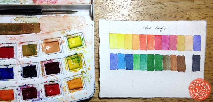
4) Van Gogh Watercolors 24-color set, which I also already reviewed here. This is the set that travels out of the house with me due to its portable design. I also use this a lot for people drawings and portraits because it has Naples Yellow Red which is a great base for skin tones. The paints are very transparent and highly pigmented, resulting in intense colors even when diluted with a lot of water. Overall I think this set has the most balanced variety of colors, making it a good traveling and journaling companion.
Best for: portraits, landscapes, food, people / journaling, traveling, urban sketching
* Available from Deovir Arts and Fully Booked in Greenbelt 5.
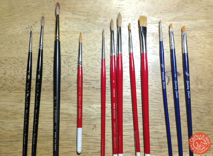
Watercolor Brushes
From left to right:
1) Winsor & Newton Series 7 Kolinsky brush size 0
2) Winsor & Newton Series 7 Kolinsky brush size 3
3) Royal Talens Rembrandt Series 100 Pure Kolinsky size 6
These three are my “investment” brushes and fortunately I get a lot of use out of them, especially from the Rembrandt because of its size. Kolinsky sable brushes are known for their ability to hold paint (no need to keep reloading the brush) and retain the pointed shape while you’re using them. I love how springy the bristles are which makes painting a breeze. No need to worry about stray hairs producing uneven, streaky marks or accidentally coloring outside outlines.
*Available from Amazon, Fully Booked GB5, and Deovir Arts
I really would rather buy synthetic hair brushes for ethical reasons so I also recommend the following:
4) Van Gogh GWVR Mini Yohitsu Visual brush size 3
5-7) Van Gogh GWVR Yohitsu Visual brush sizes 2, 4, and 6
8-9) Van Gogh GWVR Yohitsu Visual brush sizes 1/8 and 3/8
Before buying the Kolinskys in April, I’ve been using the Van Gogh visual brushes. (These are actually Arnold‘s but he gave them to me when I started painting again. 🙂 ) The brushes are made of a mixture of synthetic hair (nylon) + ox hair and goat hair. I love these brushes too and still use them up to now. Paint load capacity is good enough and, more importantly, the bristles hold the pointed shape well. I can’t achieve a super fine point with the #6 as well as with the Rembrandt #6 but they are great for general coloring and layering.
* Arnold got them from Sekaido in Shinjuku when we went a couple of years ago
10-12) Sterling Studio Golden Taklon brushes sizes round 5/0, flat 2, and angled 3/16
Given by Alessa Lanot of Life After Breakfast during the #LABWatercolorSwap. I don’t normally use brushes as tiny as these but the size 0/5 in particular made me a convert. Unlike other fine point brushes I’ve used before, I’m actually able to get a decent line out of this brush because the bristles are made of taklon, therefore it can hold more paint than other synthetic hairs. Because of this brush now I cannot stop adding detail to my works. 🙂
My workhorse brushes
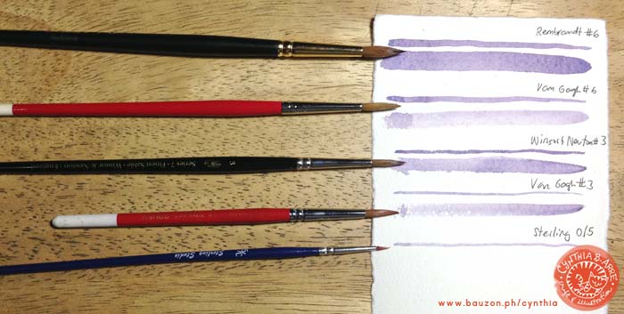
The brushes I use most often are the Rembrandt Kolinsky #6 , Van Gogh Yohitsu #6
 , Winsor & Newton Series 7 Kolinsky #3
 , Van Gogh #3, and Sterling Studio 5/0
 . I made this comparison chart (above) so you can also see how versatile round brushes are in that you can use them to draw both fine lines and broad strokes. It’s also easy to see how “thirsty” Kolinsky brushes are compared to the synthetic ones — just look at that paint load. Still, the Van Goghs are also able to make fine lines because of their ability to retain their shape which make them workhorses in my little studio.
I actually also have a Holbein Water Brush and an old set of Koh-I-Noor Watercolor Pencils but I only use them when I’m out of the house. Both are available from Deovir.
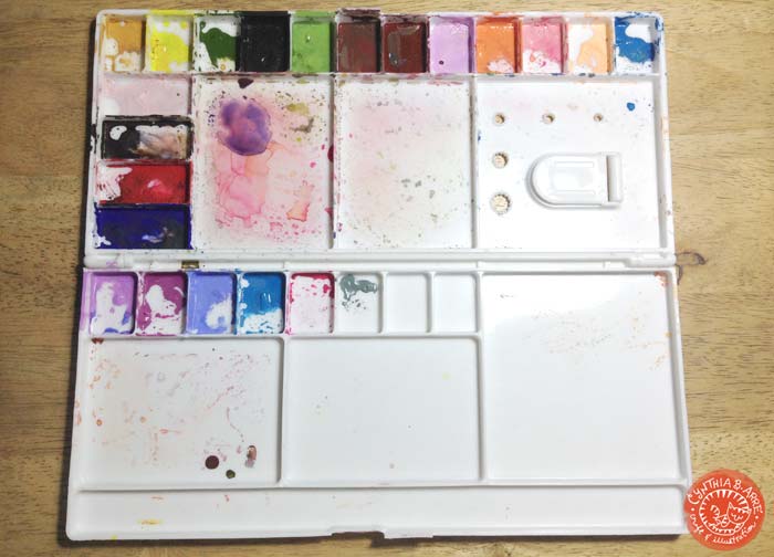
My final tool is a Reeves Folding Plastic Palette which I ordered from Amazon along with the brushes. Because of my limited watercolor tube palette, I needed a surface where I could pre-mix colors and keep them safe and usable. I haven’t changed anything that you see here in 2 months which makes having a palette like this very economical since I get to save paint (and money).
* I bought this from Amazon but I’ve read that you can get similar ones locally from Craft Central.
As for watercolor paper, for archival drawings I use Arches and Hahnemuhle (my favorites though I only buy them in sheets, not in blocks. Those are way out of my budget.) and Canson Montval Torchon, For commercial (i.e. for scanning) work, I use a Canson Montval Aquarelle block or my small Daler-Rowney Aquafine sketch pad. I also recently used up a Potentate sketch pad that was given by Craft Carrot. For practice and tooling around, I use an inexpensive children’s watercolor pad from Saizen / Daiso and a Berkeley pad.
(Feb.12, 2016: I’ve updated this list in Part 2 of this entry and added a review of my favorite watercolor papers)
I hope you guys found this useful. Please do share what your favorite materials are. 🙂