A few projects are keeping me on a food-drawing blitz and, encountering some downtime last night, I thought of painting a tomato using all the brands of watercolor that I have on hand. This Tomato Watercolor Chart™ (LOL) should prove useful as a reference since it clearly shows (1) color/pigment intensity; and (2) paint dispersion or how they spread on wet paper and into other colors. Let me share my findings with you.
For consistency’s sake I used a sheet of Canson Montval Torchon (280 gsm) for the exercise.
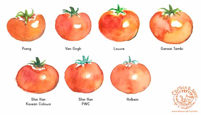
Prang (student grade) – colors are bright and the paint itself is fluid and easy to blend. Very transparent too so glazing is not a problem. Just look at that smooth finish — very impressive for a student brand. The only downside with Prang is that the colors will fade over time so it’s really best for practice work and illustrations that will be scanned/digitized anyway. (Available at NBS branches)
Van Gogh (high quality student grade, in the league of W&N Cotman) — as with Prang, Van Gogh colors are bright, fluid, transparent, and very easy to dilute and blend. The reds and greens are more intense though and from experience, the color intensity lasts pretty long. (Available at Deovir Arts)
Louvre (student grade brand by Lefranc & Bourgeois, in the league of Reeves and Pebeo) — colors come in tubes and are very bold and bright for a student brand but are more on the opaque side. It took me a while to get the colors to blend correctly (which explains the splotches) so I guess Louvre is best for artworks that are rendered in a more “painterly” or impressionistic style where strokes are intentionally pronounced and visible. (Available at NBS branches)
Gansai Tambi (high quality student grade brand by Kuretake and IMHO in the league of ShinHan Korean Colours) — very radiant colors that are more opaque than usual — but look at how bright the colors are! A little difficult to blend and produce a smooth finish though as you can see, my attempts to blend the colors yielded interesting results. I think the Gansai Tambi is more suited for flat, gouache-like renderings. (Available from Zig Philippines though I got mine from Amazon.com
)
Shin Han Korean Colours (high quality student grade brand) — I already did a lengthy review here but based on the tomato test, the colors are creamy and very intense — shockingly so that I had to water it down a bit. It was fairly easy to blend the colors but the thick quality of the paint makes it more suitable for painterly and gouache-like renditions. (Exclusively available from ArtWhale Philippines)
ShinHan PWC Extra Fine Premium Watercolors (artist grade) – straight out of the tube, these paints look bright and saturated and once you add water to the colors, they just flow into each other like butter — not kidding at all. I looove how fluid and juicy the paints are and when I use them for portraits, I can just feel the painting paint by itself LOL. And because it’s an artist grade paint, there is very little chance of fading especially if you use archival paper. (Exclusively available from ArtWhale Philippines)
Holbein (artist grade) — in my portrait painting experience Holbein is as radiant and flows and behaves almost exactly like ShinHan PWC and I can’t tell the difference, even when I use them together. The tomato above looks slightly more orangey since I don’t have Permanent Red in my Holbein set, but the colors are bright and wonderful for if you want to achieve a true “watercolor look.” (Available at Deovir Arts though my pan set is from an independent seller I met on IG)
Examples of how I’ve used some of the brands in portraiture —
Prang
Van Gogh Watercolors
Louvre
ShinHan Korean Colors
ShinHan PWC
Holbein
You can also check out my previous post My watercolors, brushes, and other painting tools for other notes regarding the brands, plus there’s so much more example work to be found (in real time!) on my IG @arncyn 😀