Posts Tagged "logo design"

Design Process: the new Itchyworms logo

NEW-itchyworms-logo-2015

A few months ago I had the honor of re-designing the Itchyworms‘ logo.

But before anything else, here’s a little backgrounder. I’ve known the guys – Jugs, Jazz, Chino, and Kelvin since 1997 when they were still college students in Ateneo. My good friend, filmmaker Marie Jamora (back then also still a student) took me to their gig in Freedom Bar and so I met the guys. We all became ICQ pals (#titohits), chatting everyday — eventually on the phone too –, and them I started hanging out with them and Marie in almost all of their gigs. I also had the privilege of designing two of their albums — “Little Monsters Under Your Bed” (with Arnold) and “Self-Titled.”

The first Itchyworms logo was based on Jazz’ concept of an “iw!” symbol that looked like a worm. Here are the initial studies and the final version as it appeared in “Self-Titled.”

OLD-itchyworms-logo-2008

As you can see, the 2008 version of the itchyworms logo looked and worked like a badge and later we learned that it was pretty hard to use in merch and posters because of its square shape. So early this year, the band approached me for a redesign. The goal was to freshen the look while retaining the “iw!” concept and make it easier to use on gig posters, business cards, signage, and other promo materials.

NEW-itchyworms-logo-2015-DEV

Pencil studies (above), and the digitized / vectorized versions (below).

NEW-itchyworms-logo-2015-a

They chose the first one (upper left) but they also wanted me to explore making a “3D version” which, I agree, perfectly reflects their vibrant, dynamic music and kwela personalities.

NEW-itchyworms-logo-2015-b

Getting there… I made several versions just to give them more options to choose from. The front-facing logos on the right won so I tweaked and developed that direction further.

NEW-itchyworms-logo-2015-c

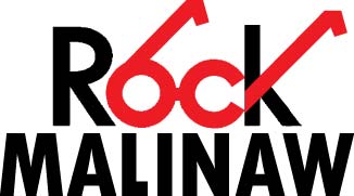
I played with lower and upper case letters and shadow effects. In the end the band chose the one at the bottom. Yay, new logo for 2015!

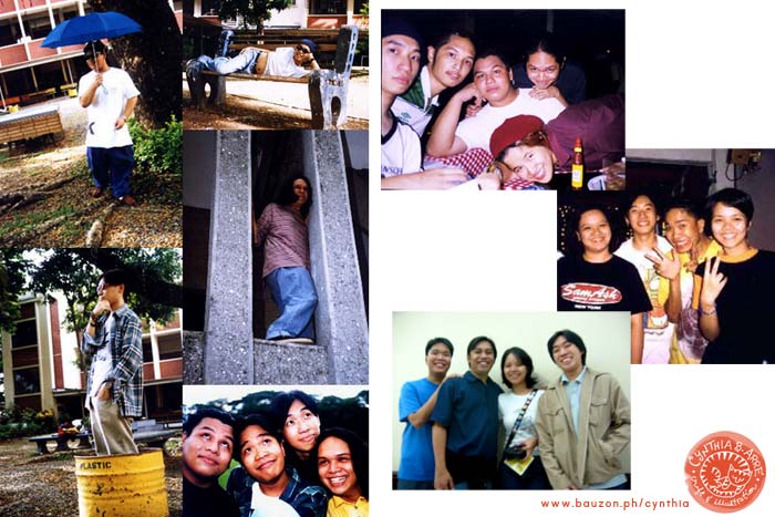
And for throwback fun I’ve included some goofy photos from the old days. 😀

old-itchyworms-pics

Share
Read More

Various logos for Rock Ed Philippines

rock ed philippines

Rock Ed Philippines logo by founder Gang Badoy-Capati

Rock Ed is a volunteer group working to provide venues and events for alternative education through projects and various activities like concerts, film screenings, exhibits etc. My husband Arnold and I had the privilege of working the group by contributing our support through art and design (and in Arnold’s case, animation).

Here are a few of the logos I made for some of the projects:

cb-arre-logos-rockedradio

Logo for Rock Ed Radio which used to air on NU107 and later on, JAM 88.3

cb-arre-logos-rockaidradio

Logo for Rock Aid Radio which provided on-air help, assistance, and updates during the times calamities struck our islands

cb-arre-logos-citizensafe

Logo for Citizen Safe, a project of Rock Ed Philippines that supported the NDRRMC (National Disaster Risk Reduction and Management Council). It comprised of a series of gigs that rallied for a demand for efficient crime investigation methods and better training for law enforcers.

cb-arre-logos-safety-series

Logo for The Safety Series. Rock Ed partnered with the Department of Health to create a sustained and accessible campaign for HIV/AIDS awareness in the country.

cb-arre-logos-rockmalinaw

Logo for Rock Malinaw, a vision-testing health project for public schools which is also tied up with Rock Eds eyeglass donation drive.

cb-arre-logos-rock-ed-X

Logo for Rock Ed X, to celebrate ten years of Rock Ed Philippines projects.

Share
Read More

I'm Cynthia Bauzon-Arre, a Filipino watercolor artist & graphic designer. I live in QC with my graphic novelist husband Arnold and our friendly marmalade tabby Abbas. This blog has been chronicling my life, likes, and loves since 2001. [ more ]

view my portfolio

Categories

Archives