Posts Tagged "illustration"

Pinoy Food Stickers, Awit Awards, and other Updates

If you’ve been checking my Instagram, it might seem that I have been making nothing but stickers…

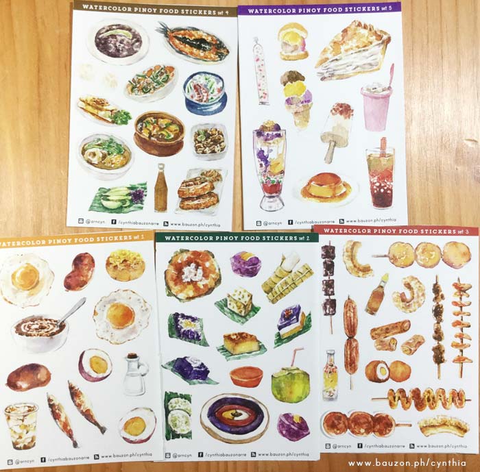
Pinoy Food Stickers — Ulam, Panghimagas, Almusal, Kakanin, and Merienda

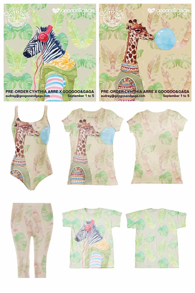
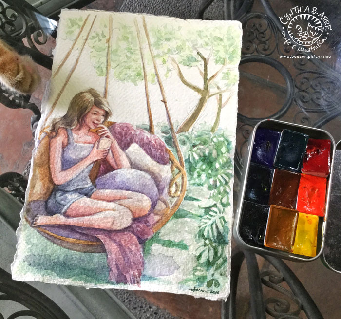
…which is partly true. The reason for this is I am mostly working offline to prepare for a major project I’m undertaking this year. Something very much-delayed in my life as an artist. 😛 Before I reveal details though, I would like to talk about my current batch of stickers. Pictured above is the Filipino Food Sticker Set which consists of my watercolor illustrations of common Pinoy food for almusal (longganisa, itlog na maalat, taho…), ulam (sinigang, bulalo, lechon kawali, adobo…), merienda (fishball, isaw, turon…), kakanin or native delicacies (bibingka, puto bumbong, sapin-sapin, palitaw…) and panghimagas or dessert (leche flan, halo-halo, sago’t gulaman…). It was a challenge to draw the ulam or Filipino dishes especially because our food is so brown and saucy! How to make them look appetizing, right? My solution was to choose food that had vegetables in them to add color, or if they’re just really brown, I placed them on a colored plate. 😀

If you’re interested in these stickers, they are available online at my shop and at Hey Kessy (UP Town Center) and Common Room (near Katipunan Ave cor. Dela Rosa St. QC).

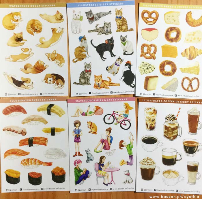
Other designs available are the following: dreaming dogs, smartly-dressed cats, bread and cheese, sushi, girls & kitties, and coffee. Each one is die cut for easy peel-off and size ranges from .5″ to 2″ — perfect for your planners and journals, yes?

stickers philippines

These can be purchased online from my shop too. In-the-making / painting photos are on www.instagram.com/arncyn.

***

Other updates since the last time I wrote here:

1. My design for Callalily’s album “Greetings from Callalily” won at last yeat’s Awit Awards for Best Album Packaging. I was in Tokyo when the guys sent me a Viber message so I couldn’t attend the event but it was such a pleasant surprise because I completely forgot about the nomination hehe. It’s my sexond Awit Best Album Packaging Design Award — the first one was for the Eraserheads’ “Fruitcake” in 1997 — 20 years ago OMG. Who knew.

A post shared by Cynthia Bauzon-Arre (@arncyn) on

2. I’ve been working on honing my figure drawing skills by attending WhoAreMaro Live Drawing Setup events. Aside from Arnold, I usually attend with my art date friends Arlene Sy and Kuki Ulpindo of ArtWhale which makes it fun and less nerve-wracking. 😀 Drawing from life is great exercise and WhoAreMaro’s setup is pretty cool. It’s just like the ones we had in school (UPCFA) where the model poses in 5, 10, and 15 minute increments but it’s more hip and millennial-y since they invite guest DJs to provide live background music and serve food & drinks at intermission. Here are drawings from the first one I attended:

A post shared by Cynthia Bauzon-Arre (@arncyn) on

3. I’ve also had two on-the-spot-portrait sessions since 2017 rolled in — one was at the BGC Art Mart and the other one at Hey Kessy’s Valentine Pop-Up. Tin of Hey Kessy took a video while I was at work (below).

A post shared by Cynthia Bauzon-Arre (@arncyn) on

4. I help my good friend and soul sis, fashion designer Tippi Ocampo with her blog every now and then. This time we changed her blog theme and updated her logo. Tippi has always had a hook and eye logo but she had an idea to use her initials “TO” as the hook & eye and I executed it in graphics for her. 🙂 Please visit her site for her updates — she is one of the most talented and insightful people I know. <3

A post shared by Tippi Ocampo (@tippiocampo) on

5. Have I mentioned that I have an online wedding invitation store (and moderately active wedding blog) called Poptastic Bride? I was very active about updating it from 20011-2014 until I got pulled into the arts & crafts scene. The blog is still up and I post updates and freebies (printables) every now and then. I also made an Instagram page for my invitation portfolio. 🙂 Below is one of my bestsellers:


That’s all for now. I promise to update more often this year!

Share
Read More

Googoo&Gaga Artist Collection – Watercolor Series + Musings

Excited to tell you guys that super cool apparel brand Googoo&Gaga has invited me along with fellow artist Wiji Lacsamana to come up with designs for their 2016 Artist Collection series. This year they’re focusing on watercolor art. 🙂 I’ve always been a fan of Audrey & AJ Dimarucot’s Googoo&Gaga’s quirky designs (and designer AJ has been a friend since the late 90s) so I was happy to be a part of this collaboration.

Here are the designs I came up with. They come in all sorts of clothing styles too — onesies, tees, lap t-shirts, t-shirt dresses, leggings, and even swimsuits which is pretty cool, right? The pre-order period is over but I believe you can still place orders through this link or by clicking on the image below.

googoo & gaga x cynthia bauzon arre

Googoo&Gaga x Cynthia Arre

I wanted to come up with designs that were fun and quirky without being “cutesy” since these qualities are what sets Googoo & Gaga apart from the other kiddie brands so I thought of drawing animals sporting human clothing and acting like they couldn’t care less. ;P I chose a zebra and giraffe because I read somewhere that these animals, normally found in Africa, actually exist here on our shores — in Calauit to be exact. I thought it would be interesting to set them against tropical foliage to reflect that fact. 😀

I had a great time working on them — and making illustrations for a brand for a change — and would love to have another opportunity like it again. So if anyone out there reading has an idea for a collaboration, please shoot me a message and let’s see what we can do.

***

via GIPHY

To you guys subscribed to this blog (yes, all three of you ;p) I must apologize for the lack of updates and for also being a little impersonal lately. I know I’ve mostly been posting ads for workshops or new products in my store and the occasional product review. Where have all my musings and indirect confessions of inadequacy gone, right?

Well, here goes. I often find myself wondering about what I’m really doing. Shouldn’t I busy myself with making money instead of art? Obviously I can earn more as a designer since that’s what I do professionally but I have stubbornly been focusing more on improving my skills at drawing rather than pursuing what I already know how to do. If there’s something I’ve clocked in over 10,000 of hours on, it’s graphic design. But here I am trying to get into the world of illustration, unknown territory. Perhaps it’s because I almost had it — I was on that route a long time ago. I used to paint everyday. I drew portraits of my idols (River Phoenix, Ralph Macchio, and, okay, the Menudo guys) in charcoal back in high school. The late Jose Joya, a *National Artist*, gave me the honor of being a recipient of his award in 1988. And then I slipped down the rabbit hole of commercial work and all traces of my previous budding illustrator self disappeared.

Around 10 years ago, a friend / fellow artist I greatly admired complimented my portfolio but then asked to see my personal work. My mind went blank. I asked him sheepishly, “what do you mean, ‘personal work’?”  He said, “you know, art you’ve done just for fun.” And so it struck me that I had absolutely NONE to show. Everything was for a client. Even the band stuff. I had fun working on them, yes, but they weren’t for *me*.

BUT. 2014 happened and I’m back on that track or so I’d like to think. I have a long way to go still but whenever I feel like giving up and going back on familiar ground, I scroll down my Instagram, look at the body of *personal work* I’ve amassed, and keep soldering on.

***
p.s. Incidentally, I do almost always post personal musings on Twitter more than any other social network because I know I can write anything and my post will get buried in a few minutess so maybe I’ll see you there? 😀

Share
Read More

What Colors to Choose for a Minimalist Watercolor Palette + White Nights Review

Since White Nights (a.k.a. St. Petersburg) Watercolors from Russia became available here in Manila via Deovir, I’ve read a lot of reviews online and have even heard from art-friends that they are easy to re-wet and are highly pigmented. So, being low on EQ I decided to get a few pans for myself. You might already know that I’m not a fan of buying sets (though I have some but they’re either gifts and/or were purchased when I hadn’t the slightest clue about pigments and lightfastness) so I made sure to do my research before buying the paints. My self-imposed rules:

  1. I must be able to use the colors and their combinations in what I love to draw the most — faces, food, and felines (okay, animals in general :))
  2. The colors must consist of single pigments — this is to ensure lightfastness and also reduce the incidence of mud when layering.
  3. They have to fit into my handy DIY mint tin palette, meaning a maximum of 9 pans was in order.
  4. I can’t spend over P1,000.00 because do I really need another set of paints? Umm, no  (see previous post), but then need is sometimes < want. Fortunately White Nights, like ShinHan, isn’t as expensive as the other brands so I was able to stay below my limit.

White Nights Watercolors customized palette

So taking all that into account, here are the colors I ended up with along with their pigment info & light fastness ratings:
— 2 reds (1 cool, 1 warm): Madder Lake Red Light (PR 187 / LF ***) and Cadmium Red Light (PR 108 / LF ***)
— 1 warm yellow: Cadmium Yellow Medium (PY 35 / LF ***)
— 1 green: Emerald Green (PG7 / LF ***)
— 2 earth hues: Raw Sienna (PBr 7 / LF ***) and Burnt Sienna (PBr 7 / LF ***)
— 2 blues (1 warm, 1 cool): Ultramarine (PB29 / LF ***) and Prussian Blue (PB27 / LF ***)
— 1 neutral: Payne’s Grey (PBk7, PB15, PV3 / LF **)
[source]

The last one, Payne’s Grey is not a single-pigment color (it’s made up of 3 pigments) and is something I could’ve gone without since I can mix greys using some of the colors so it’s really just a handy “convenience hue” for days when I can’t be bothered to do extra mixing. 😀

Just to show you the range of colors that are possible using just these 9 pans, here are a couple of watercolor charts I made:

White Nights Watercolor Chart

This one (above) shows the range of color combinations and tonal ranges that can be achieved from mixing the brights with the darks. And just because I always paint portraits and people, I made a separate color chart mainly for the reds and yellows (below). I just added the column for green since there was extra space.

white nights watercolor chart skintones

Here’s something I painted using just the colors in the palette (you can view the work-in-progress video on my Instagram). I used them on Khadi Paper purchased a while back from ArtWhale.

white nights watercolor palette

My capsule review for White Nights Watercolors:
1. Indeed they are easy to re-wet, pick up with the brush and are highly pigmented (some colors more than others though)
2. They are also highly transparent — except for the Cadmiums which are opaque — so they are great for layering.
3. At only P87.00 per pan (except for the Cadmiums which are I think P120 / pan), they are quite affordable. My customized set amounted to around P849.00 and it consists of colors that I will actually use. (Sets usually have 3 or more pans that I always end up never using.) Also, these are FULL pans, not half pans, so you get a lot of paint for your hard-earned cash. 😛

And here is something else I painted using White Nights, a simple maguro sushi for my Youtube Channel (hah! If you’re one of my whopping 3 regular viewers, thank you for not laughing at my attempts to make these home videos <3)

Other observations:
1. ShinHan, Holbein, and Daniel Smith are still my favorites in terms of color intensity and flow but I’m happy to have this inexpensive set of vivid paints for drawings that will be scanned and for practice work. Van Gogh, my student-grade set that was a birthday gift from Arnold last year, is my other go-to for practice work but they are strangely more expensive than White Nights.
2. The pans remain moist for a while so I can’t close the lid of the tin until they dry completely because they might stick in the lid when I store them sideways.

Share
Read More

I'm Cynthia Bauzon-Arre, a Filipino watercolor artist & graphic designer. I live in QC with my graphic novelist husband Arnold and our friendly marmalade tabby Abbas. This blog has been chronicling my life, likes, and loves since 2001. [ more ]

view my portfolio

Categories

Archives